Here are some epic examples of clean web design inspiration to inspire your design:
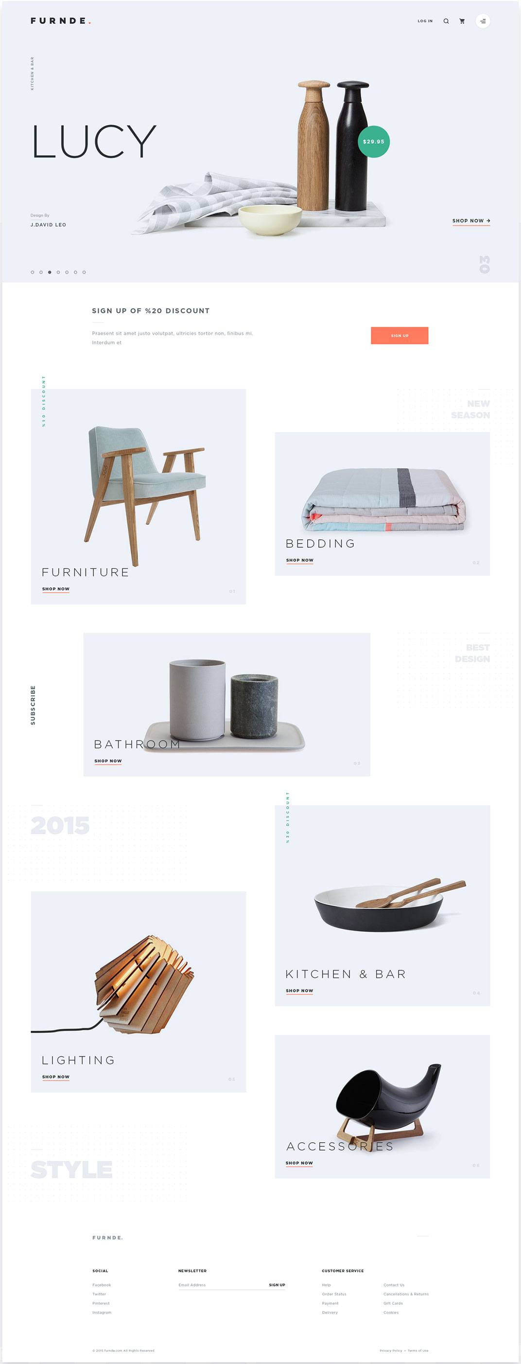
Furnde Theme – Enes Dal
The stark feeling of this design mirrors the decor and home goods it’s pushing. As stark, clean, even brutalist design is on the rise in web design, it’s also huge in architecture and decor as well. Whether you’ve noticed the rise in Instagram photos with white backgrounds, white desktops, and white and cream fashion statements, or you already have your house decked out with white and gold – it’s hard to deny the trend if you’re watching social media influencers. Use photographs with a white backdrop and only have the object photographed covering one-third of the background – leaving space on the edges to overlay text which allows for this clean design look.
Rick Ross Concept Design – Jack Dusty
Toss in a little gold, and you get a highly tasteful, mildly decadent look. Though I’ve seen gold paired excellently within the use of clean design before, the rise of this method is becoming more sophisticated. It’s certainly gaining steam in the use of rugged and masculine websites beyond what was once utilized within women’s clothing and interior decoration. Expect to see this trend continue, and take a hint on your next design project.
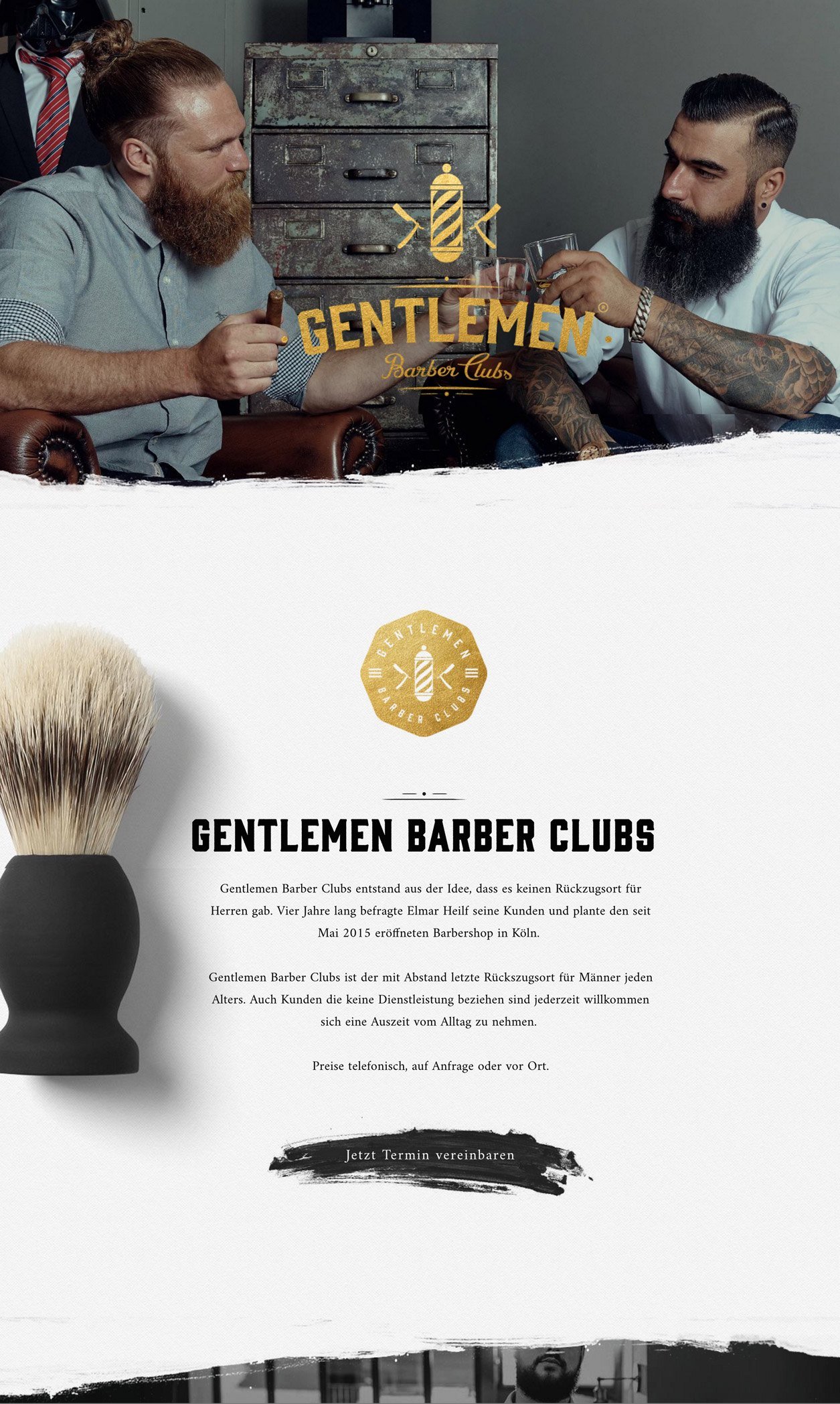
Gentlemen Barber Clubs (German) – Found on Web Design Inspiration
Here’s another excellent example of a ruggedly-handsome and clean website design. There has been a trend of using neatly arranged elements to accent a flatter design. This is not a resurgence in web design of websites trying to appear physical (commonly referred to as skeuomorphism), but a more mature, tasteful and restrained integration of physical items. When done well, maintaining an overall ‘flat’ surface in the design as a whole, you can achieve a look that can be striking, like the above example.
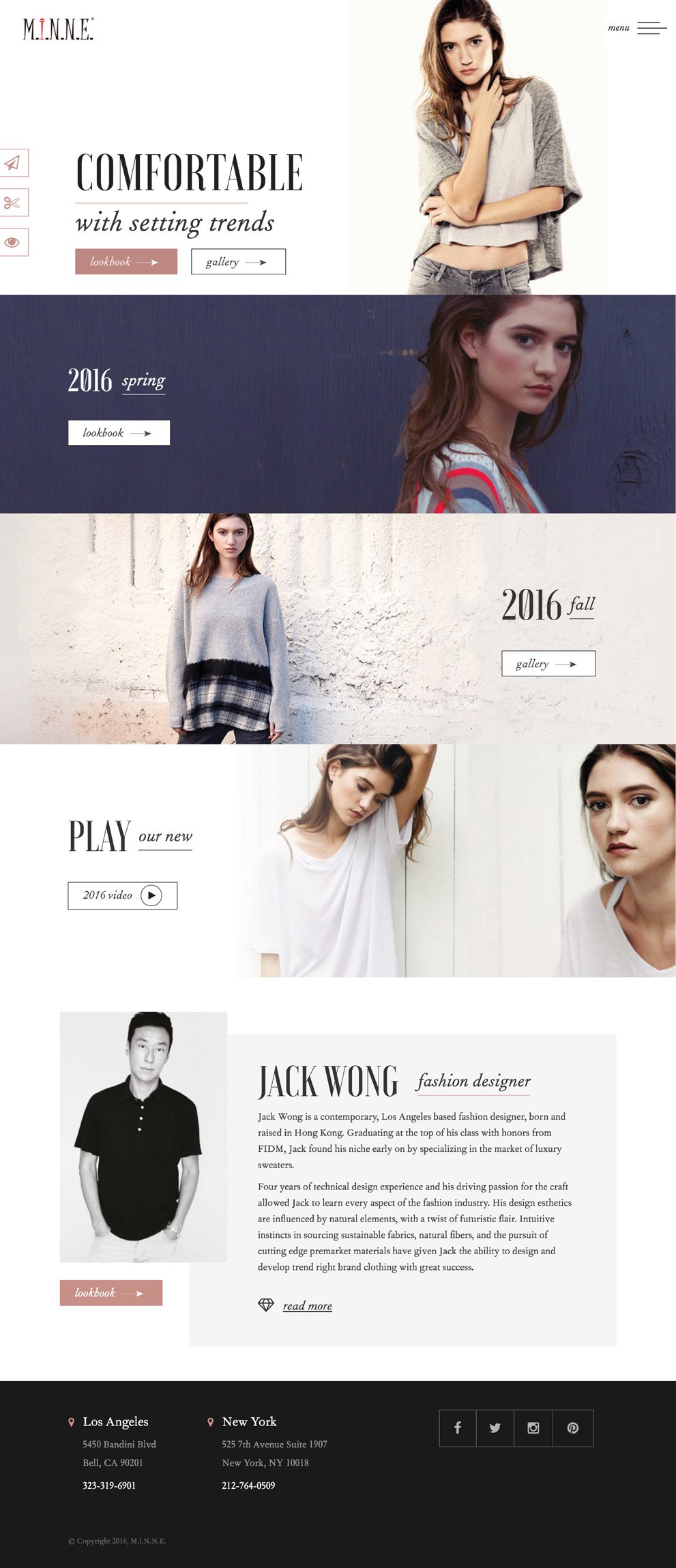
Minne Apparel – Website Design by Snap Agency
Fashion has been ahead of the curve for awhile on this web design trend. Along with the ample white space, and clean-looking elements, Minne Apparel’s website showcases the brand, utilizing elements of Pantone’s colors of the year for 2016 – Rose Quartz and Serenity. Offsetting white space with hints of pale pinks, cream or blue will give your website a soft or warm feeling to your design, wardrobe or decor.
Rock Group Infographic Theme – ThemeREX
Infographics have become very popular, but some of them feel messy and not very coordinated. When you can mix infographic elements with clean open spaces you can create something that displays information for people to consume quickly, without jarring their eyes with something that seems like it was pulled from twelve different places. This design does this extremely successfully as the elements use very similar styles every step of the way and is not stuffing a bunch of elements in a small amount of space, but instead slowly reveals more and more. This approach leads to a cleaner design and is an effective use of the vertical scroll – as research has proven, people do indeed scroll as long as there is some indication that there is more below the fold. Clean design is pivotal to maintaining a high-end feel. When appropriate, it’s essential to pay attention, to maintain the trust of the visitors to your site. Beyond this, in a world of clutter and new phone notifications every five seconds – people appreciate an open and clean design as it gives the impression of clarity of purpose and openness. Whether you’re using this clean web design inspiration to inspire your decor, other kinds of design or your next user interface design project, that’s a feeling that’s good to foster. Featured photo credit: Pexels Free Stock Photos via pexels.com

![]()


